Fonts with programming ligatures
- Authors
- Name
- Tyler Andor
- Published on


The inclusion of programming ligatures in a typeface can improve the readability of code by aligning the semiotic with the semantic.
In programming and other formal languages, multiple Unicode characters are combined to form a lexeme, or a singular logical expression. Such expressions have a unary meaning and function. By symbolizing them visually in a similarly singular manner, ligatures improve upon the aesthetics and readability of programs.
In my experience, ligatures in combination with a well designed typeface can make long days of reading and writing code less visually taxing, and generally more enjoyable.
Type to live with
In his book On Web Typography Jason Santa Maria explains the difference between decorative type, which he calls "type for a moment", and the kind of type that works for long-form content. The latter he refers to as "type to live with".
When searching for good options for long-form text, we need to recognize that we’re asking someone to live with this typeface for an extended period of time. Every eccentricity is amplified when used page after page. A visual quirk like a whimsical tail on the end of a g’s bowl may be cute when we see it once or twice, but over the course of a few pages, it can stick out and distract from the text, like that guy sitting in front of you at the movies whose nose whistles every time he breathes.
I think this holds particularly true for programming fonts, where the long-form content is thousands of lines of uniquely formatted code.

If you're interested in trying, or finding a new monospace font with ligatures, here are some ideas.
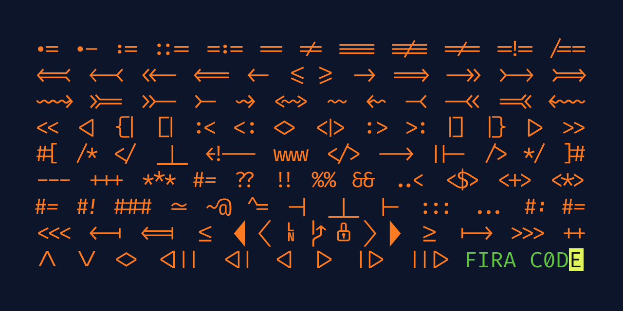
Fira Code
The first font with ligatures that I used remains my favorite. Fira Code, created and maintained by Nikita Prokopov, is built upon the monospace version of the Fira family.

Prokopov gave an insightful interview on The Changelog, in which he discussed Fira Code under the umbrella of open source software. He explained the multiple character, single operator idea this way:
Yeah, so the idea is that if you type two characters to build a single operator, your brain has to sync with as “Okay, I see two characters, but it’s actually part of a single thing, a single operator. And then if you just see a triangle, an actual triangle, without any gaps - it’s just a single thing, so it’s easier for you to like “A-ha. This is a single thing.”
A few things I like about Fira Code include it being:
- exceptionally readable
- usable in nearly any programming language
- open source
- made by a software engineer
- actively developed and maintained
In the interview, Prokopov also summarizes the aesthetic experience of using a font with programming ligatures.
It’s just nice to have – I don’t know why would you want to look at simpler, not beautiful, broken glyphs, not aligned properly, when you can be looking at the same thing, but rendered much nicer.
He does note, however, "You will not write better code with it…"
JetBrains Mono
I like to keep a distinction between my personal and work machines. One way I’ve done that uses different color schemes for the terminal and Vim. When I’m really enjoying a specific color scheme, though, I’ve found that just using a different font creates an experience unique to each context.
JetBrains Mono has worked well for me as a secondary option, or work machine font.
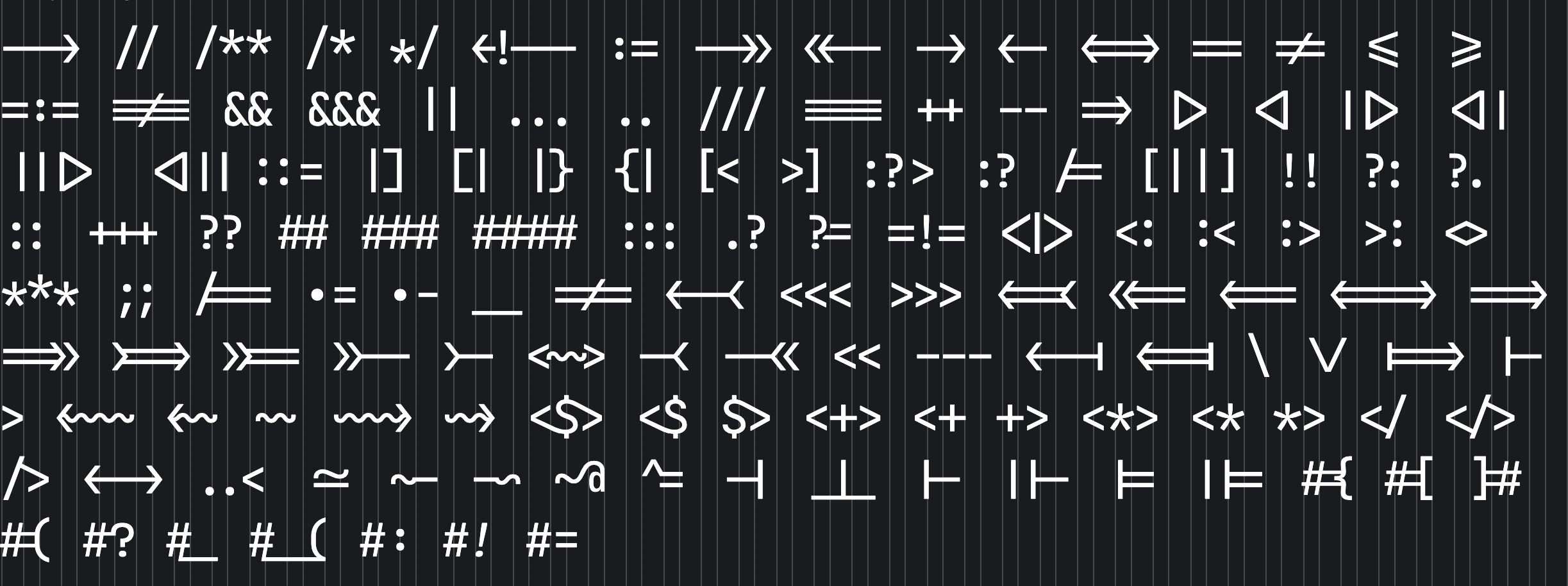
It's not surprising that a company known for its excellence in creating programming software would design a typeface with special attention to developer experience.
The website includes a thorough explanation of the ways in which the font is designed for programming-specific readability. For example, a note on character shaping:
The shape of ovals approaches that of rectangular symbols. This makes the whole pattern of the text more clear-сut.
The outer sides of ovals ensure there are no additional obstacles for your eyes as they scan the text vertically.
JetBrains Mono is also free and open source.
Other Options
I find that for my own preferences character x-height and width matter significantly for readability. I like a slightly taller than average x-heigh, and a somewhat narrow width—narrow here as compared with other monospaced fonts. Fira Code and JetBrains Mono resemble what I take that to mean.
Narrower width options might be of interest if you tend to work with several splits and panes open at once. Something like Iosevka might make things feel a little less crowded.
If you like the comfort of an especially tall x-height, or if you don't love monospace fonts generally, and yet haven't left taste and decency behind altogether to write code in something like Arial, take a look at Hasklig. It's designed for writing in Haskell, but works fine for JavaScript as well.
There are of course enough options in the space of fonts with programming ligatures that you shouldn't have any trouble finding one that works for you. See the collection by Andreas Rein for some additional options.